Making a brand new exchange look safe enough to move money into.

Details
Duration
11
months
Category
Web3
scope
Branding
UX/UI
Website
Overview
Kuru came to us as a protocol on testnet. The technology worked, but there was no brand and nothing user-facing.
That's a problem in DeFi. People decide whether to connect a wallet in seconds, and a new exchange has no history to point at. Launch was one month out.
Approach
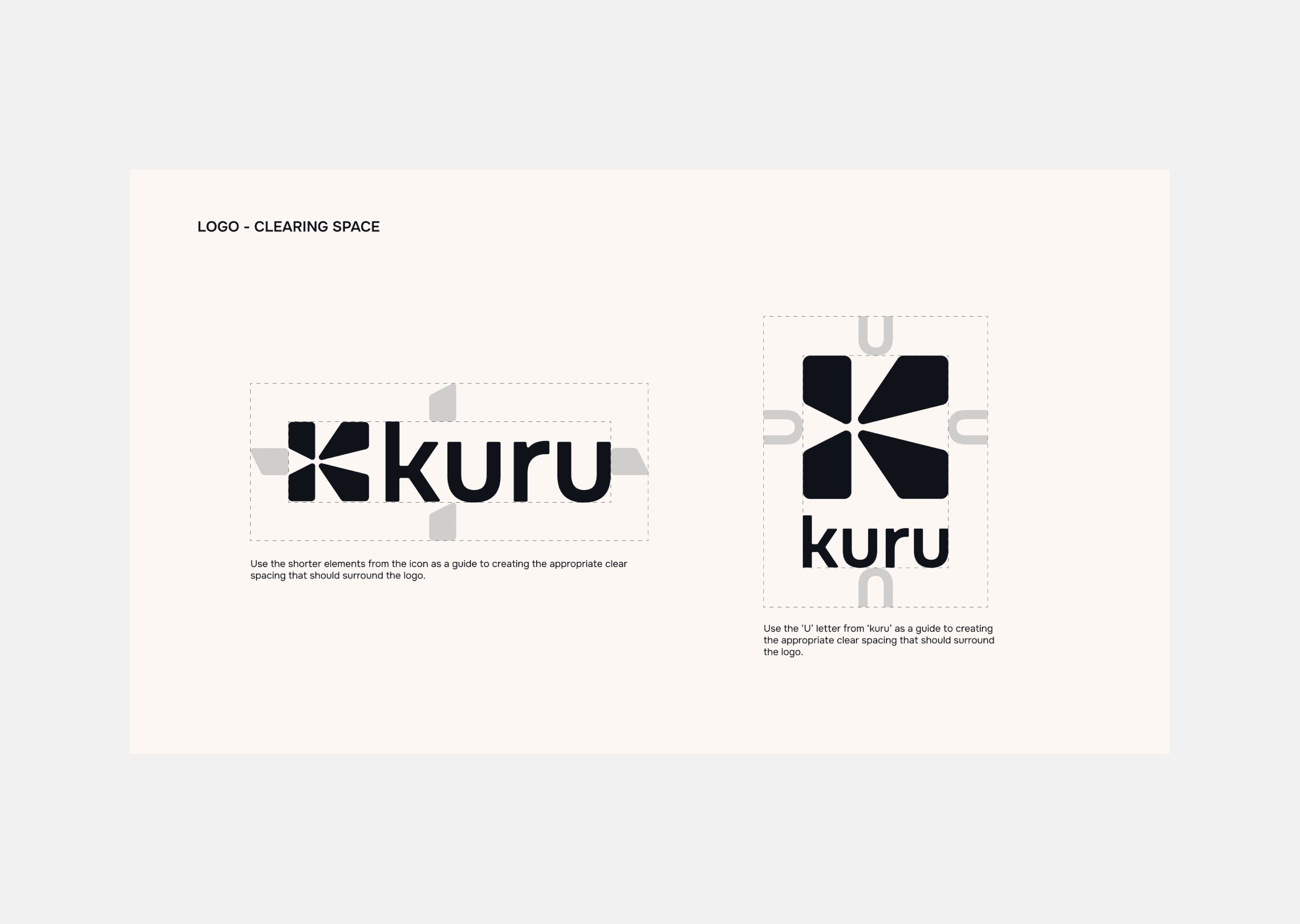
Built the identity from nothing, because a protocol on testnet has nothing a user can recognise
Mapped the information architecture first, so the screens had a structure to sit in rather than the reverse
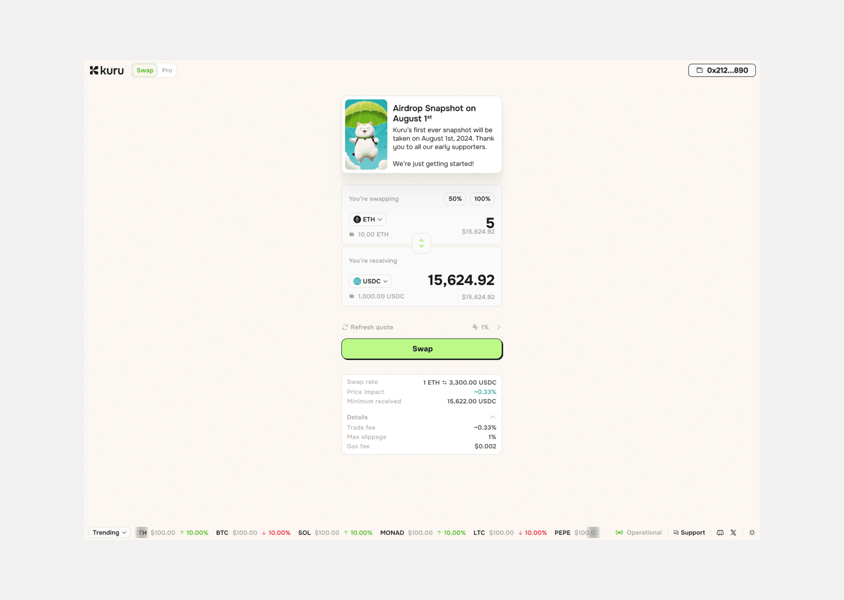
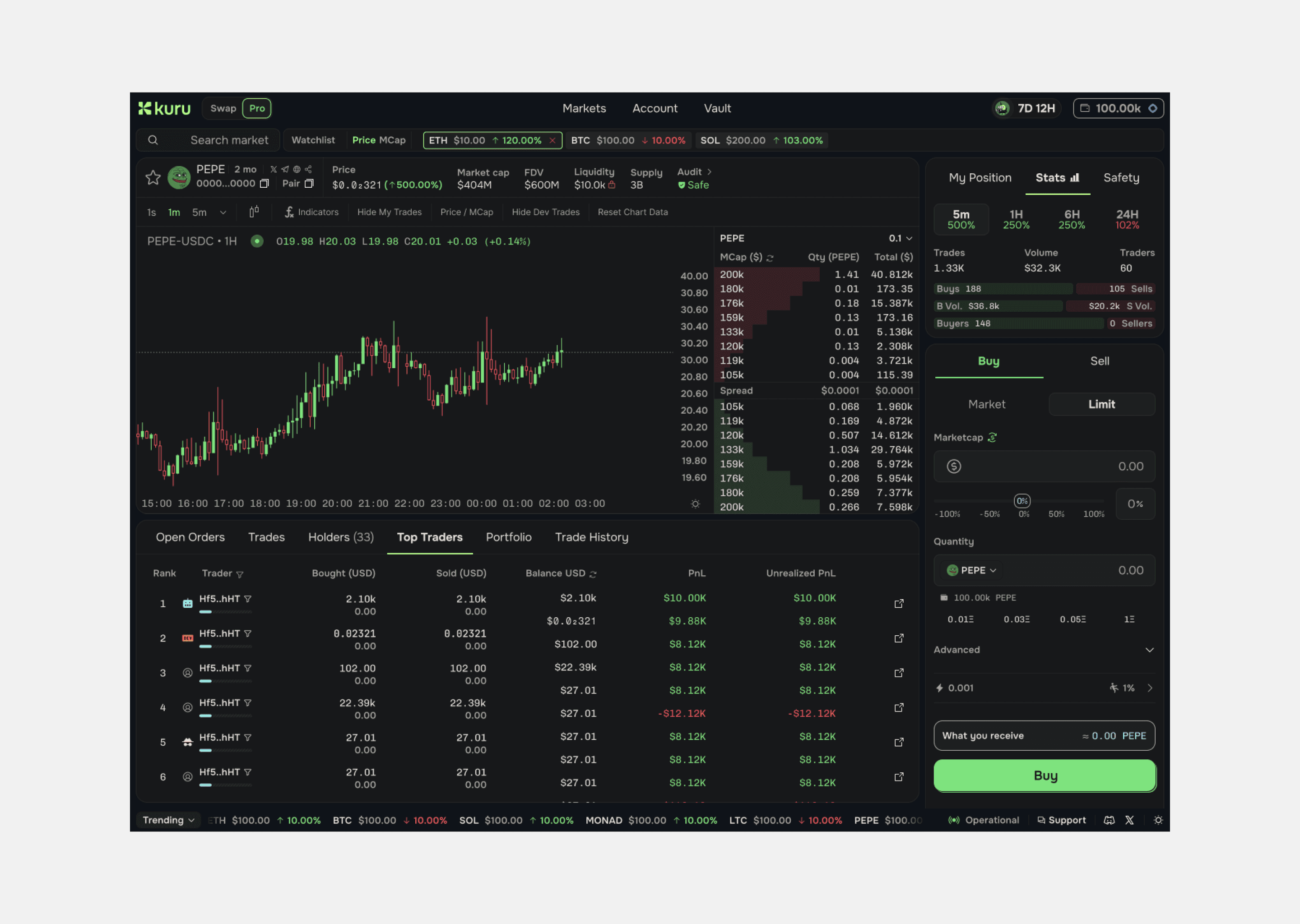
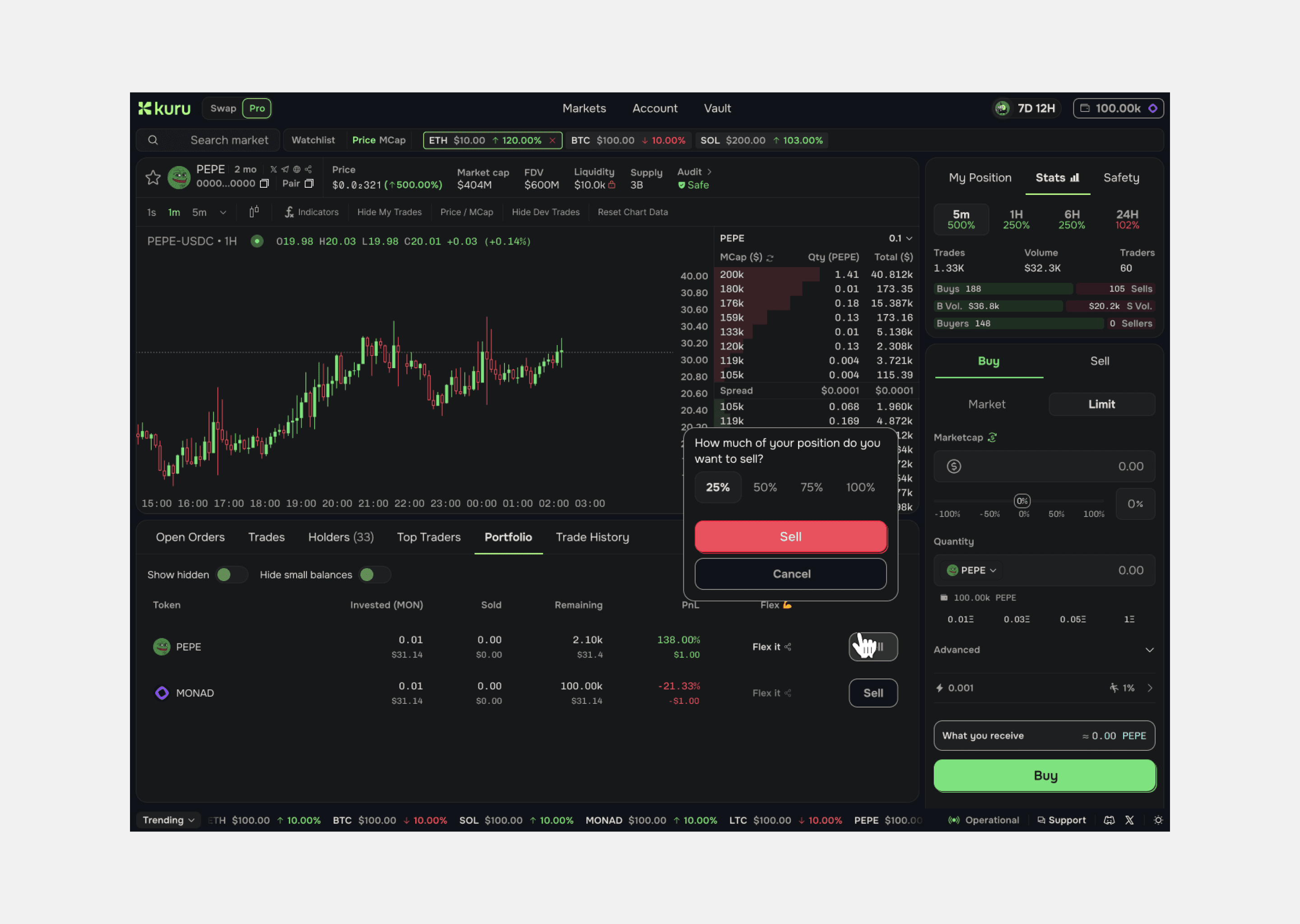
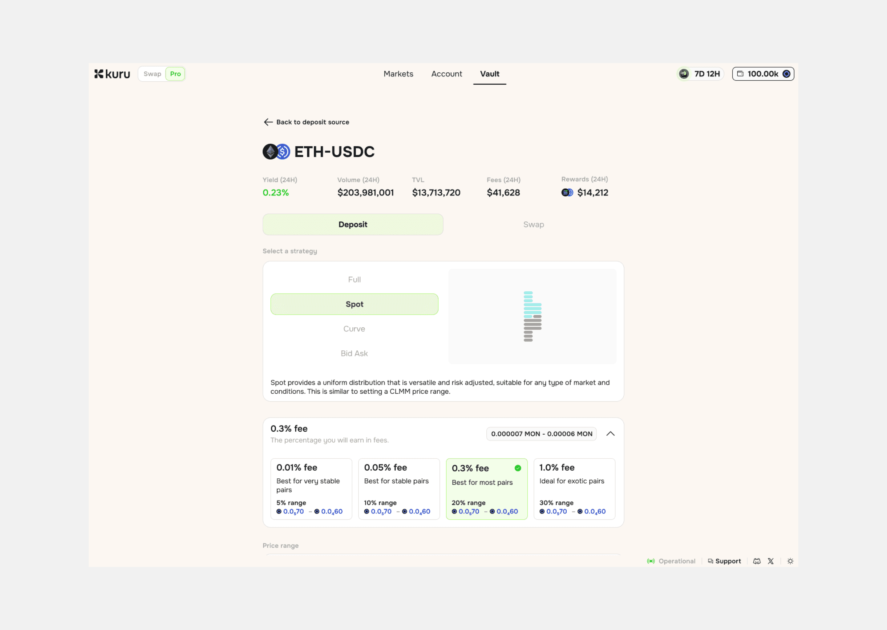
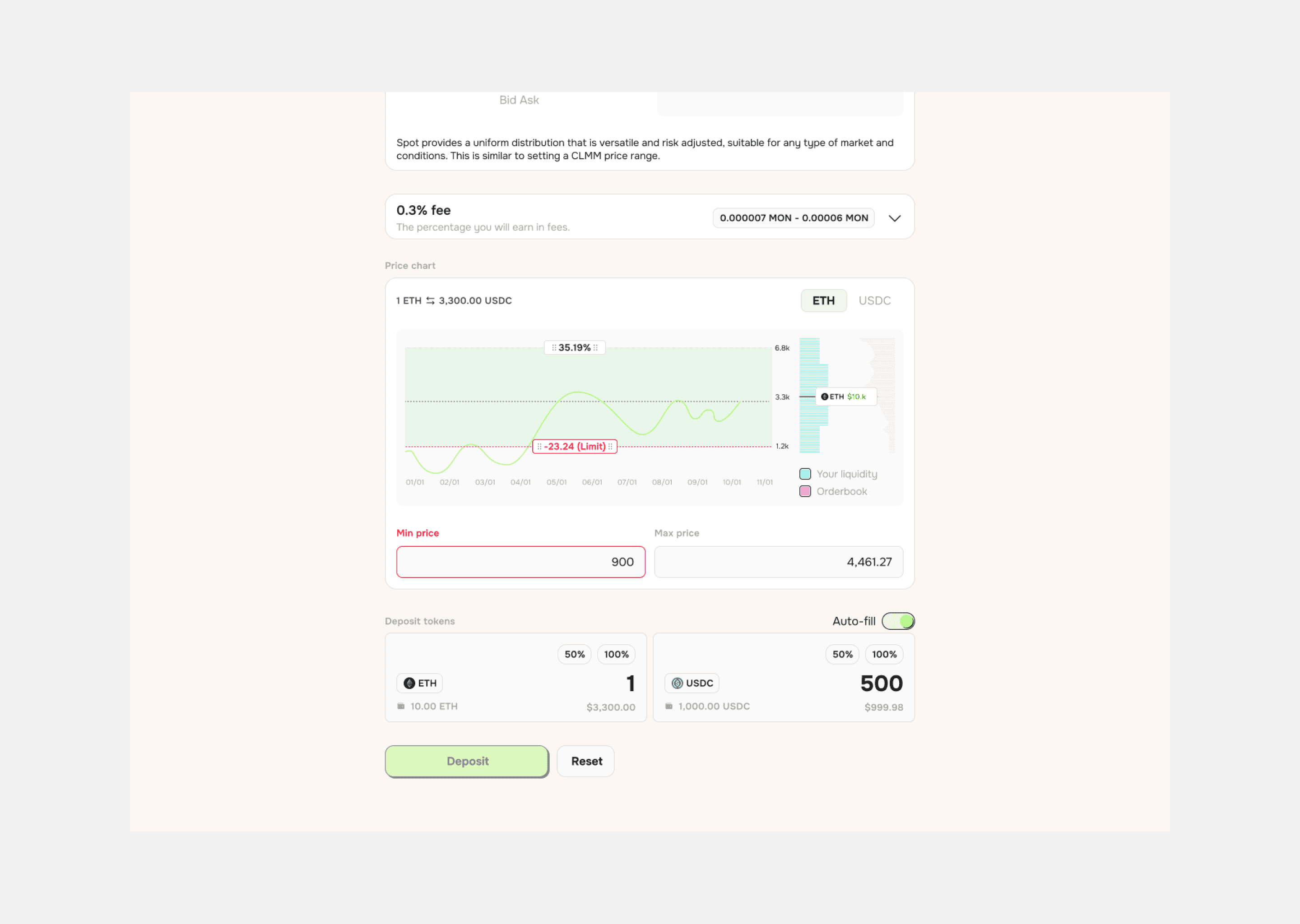
Designed swap, positions and vault strategy on conventions traders already knew
Shipped launch-ready in one month. The date was not moving
Stayed 11 months past launch, iterating on what real usage showed
Fravashi
,
Co-Founder
"From concept to launch in 1 month, Jon and Mat's work on our brand kit & DEX design was exceptional. Their team is talented, responsive, and a pleasure to work with."
The Call
Kuru was the first central limit order book on Monad, and it combined DEX features in a way nobody had shipped before. When you've built a genuine first, the obvious move is to make it look like one.
We didn't. New mechanics plus a new interface means learning two things at once, while deciding whether to put money into a protocol with no track record, on a chain with no track record. Unfamiliar reads as risky when funds are involved.
So the interface uses conventions people already know. Familiar patterns, familiar placement, nothing that makes a user work out where they are.
It means the product doesn't stand out in a screenshot. First movers usually want to.
Outcomes
Kuru went from testnet protocol with no brand to a launch-ready product in one month. The visuals have changed since. The information architecture and product structure we set are still what the exchange runs on. It has since raised $11.6M from Paradigm, Electric Capital and Credibly Neutral.